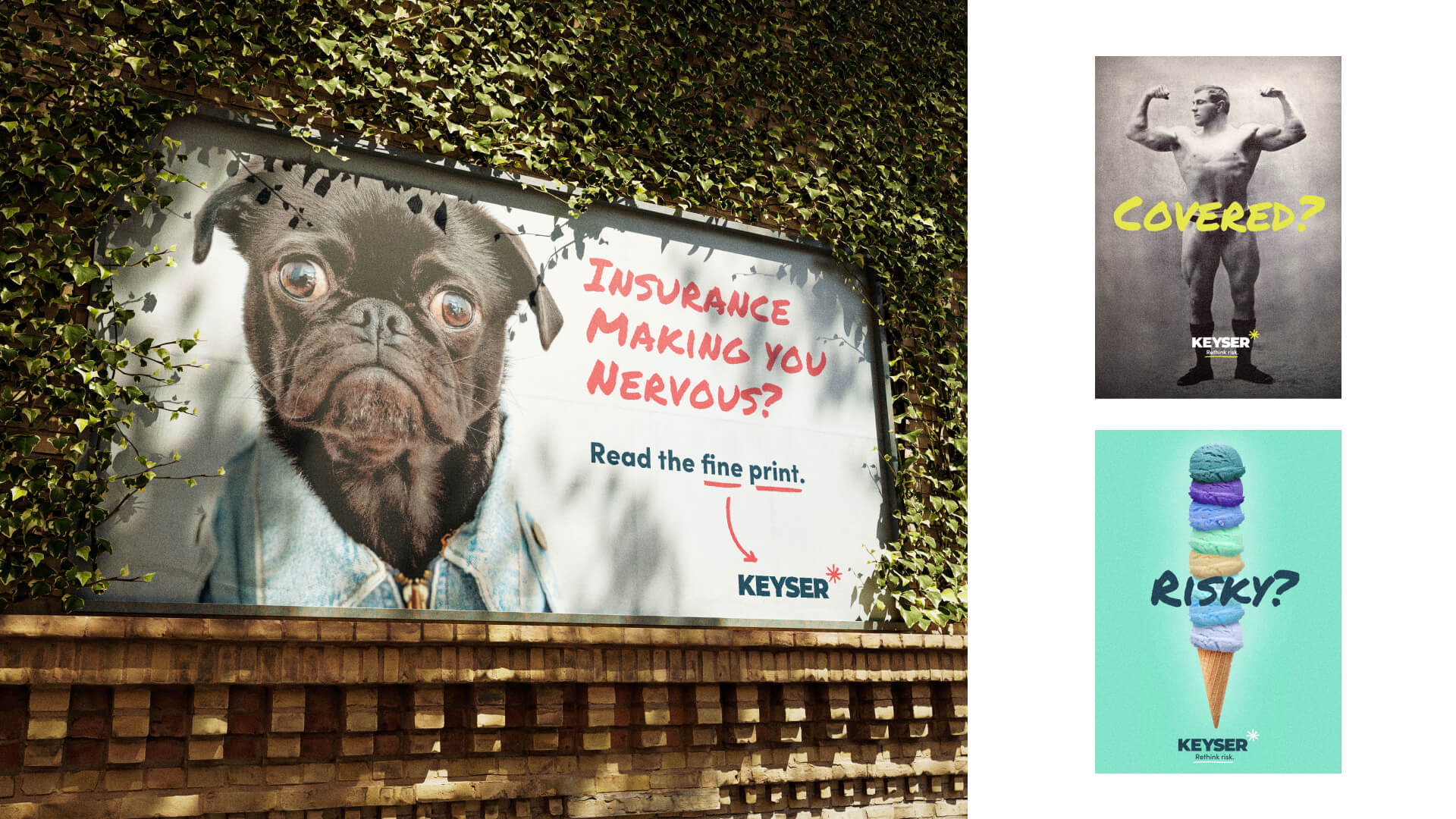
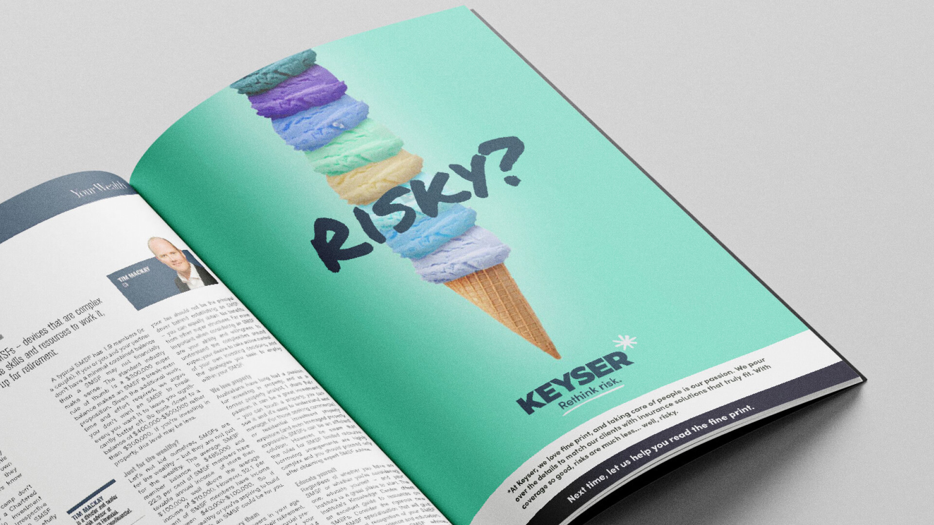
Keyser needed a daring brand that celebrates their unique position. This insurance company branding doesn’t take a typical approach to risk and coverage. Using a combination of nostalgic imagery and personified animals, the direction invites a new view of risk. Six scoops of ice cream… Risky? Absolutely! But, it sure looks fun!
The engagement included the following:
Brand Workshop | Aligning the disparate teams around the core value offering and brand refresh required input and buy-in. Circa hosted a brand round table with key team members ranging from top-performing agents, executives, administration, and one of the most tenured employees. The round table surveyed current brand successes, areas of confusion, opportunities for alignment, and potential challenges in a brand refresh. This set the foundation for the brand messaging, the brand playbook, and the brand launch campaign.
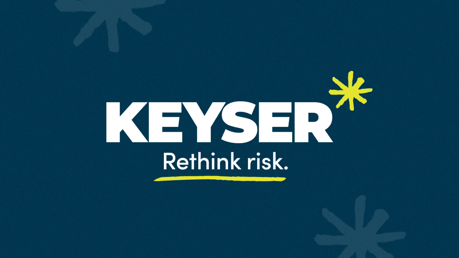
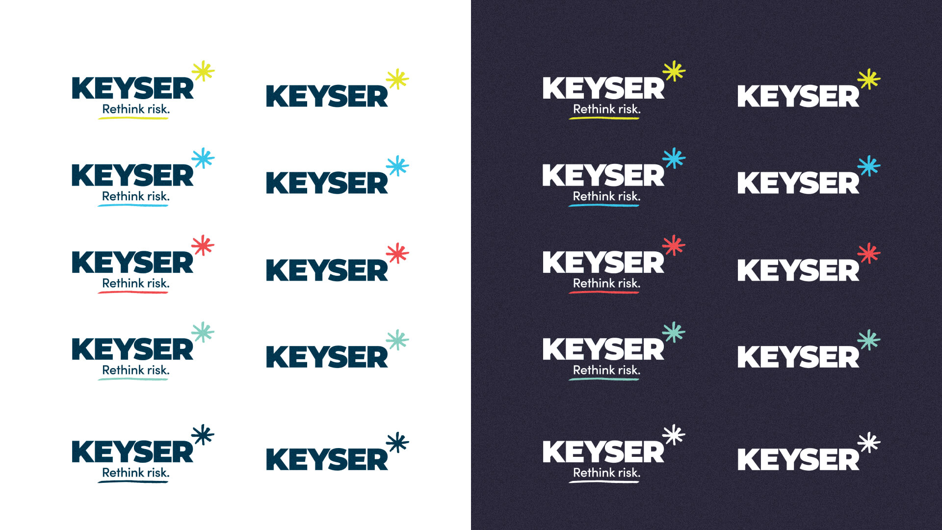
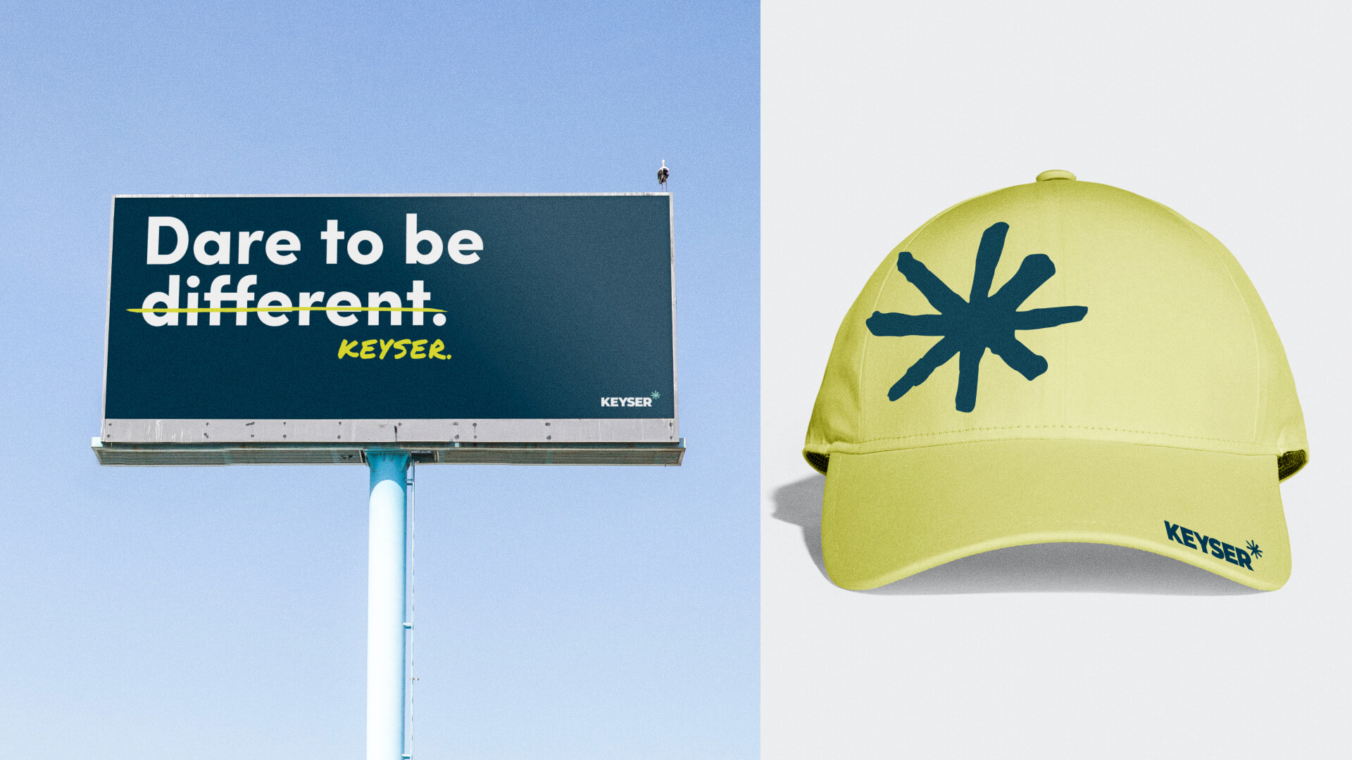
Logo Redesign | The original Keyser brand dated back to 1935. Circa was given the directive of an iceberg, a popular metaphor used by the CEO to describe the unseen risk that Keyser covers. Circa translated the iceberg metaphor into an asterisk, a glyph that, like the iceberg, symbolizes the importance of what isn’t seen, in this case, the small print. The mega-asterisk speaks to the expertise of the team, and how they make the process fun. It celebrates the right amount of risk in a playful adventurous tone
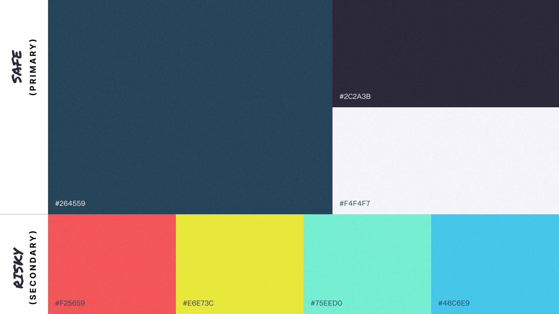
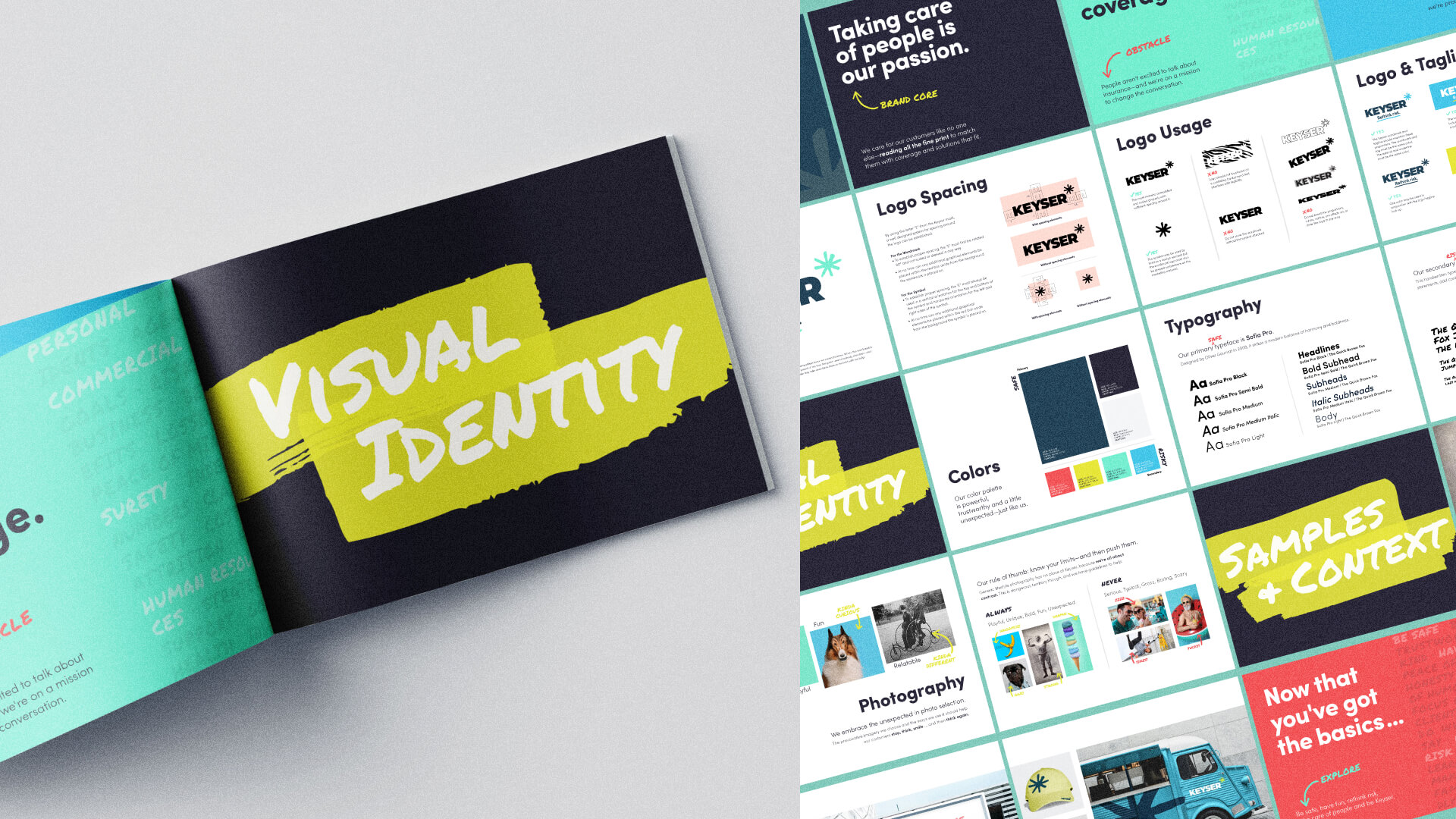
Brand Guide | Aligning 16 offices across two states required extensive brand architecture. The brand playbook included location sub-brands and brand iterations for the client marketing team to implement during the brand launch. Direction and sample applications for print collateral, marketing collateral, and social media campaigns all empowered the internal team with brand ownership.
Brand Messaging | Breaking away from the typical insurance jargon, Keyser’s messaging included a tagline: “Rethink risk”. Headlines like: “Dare to be different.” and “Play it safe.” and a bank of adventure-oriented call-to-actions invite the audience into the narrative while establishing the expertise within Keyser.
Within a year of implementing their new brand, Keyser gained international attention from one the leading insurance brands, Acrisure, which was looking to acquire, “growing firms, with professional staff, infrastructure, (and) proven profitability.” Currently valued at 10.8 M, the Keyser brand continues to make a bold impression as a stand-out insurance agency.